From the moment the idea arose to tackle the issue originating from Erasmus MC, it…
The Team VERO brand
A proper team can be recognized. A team stands together, works together towards a goal, in our case: safe aerosol treatment! After the initial start of the team we also needed a name, logo and identity.
After some brainstorm sessions we decided on what is currently there, this amazing logo for and the name Team VERO. Vero is a short term, easy to use and recognizable. It is the contraction of virus and aerosol without associating us with the aerospace industry. Which was a risk when using the term aero. A lot of names did not make it, here are some noteworthy competitors:
- Aeromedic ,
- TASC – The Air Safety Crew,
- Aerocatch,
- Aerosolution.
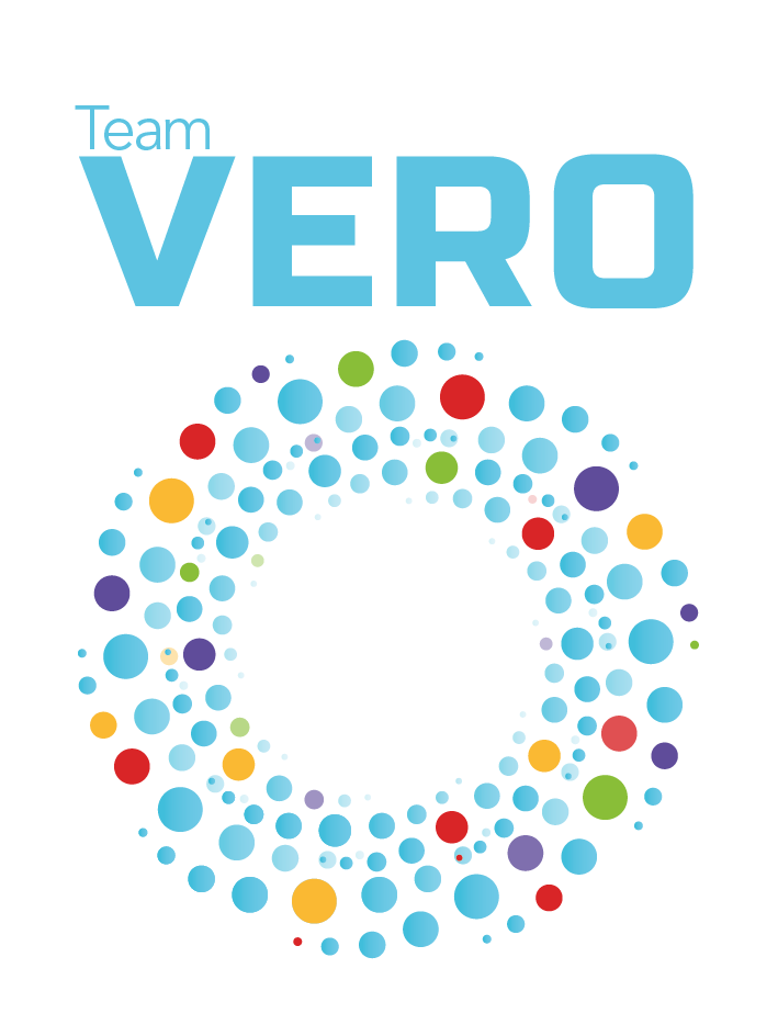
The logo needed to represent us: cooperative, engaged, talented and cool ;). We were inspired by vortices, those are dynamic and stirs up the dust. This fits our goal to innovate aerosol therapy. The vortex is made up of several particles of which some are coloured, representing the aerosol containing medication and possible cotangents. As it fit perfectly the vortex makes up the O in VERO. The pastel colour-palette is non-invasive, which is how aerosol treatment should be experienced. The colourful 4 secondary colours appeal to children, which are a part of the patient group we are interested in.
Related Posts